Intermediate / Canvas basics
Draw a Sharper Canvas on High-Density Screens
A canvas can have correct proportions and still look softer than nearby text. On a dense display, several physical pixels may represent one CSS pixel. The current examples prioritize a fixed, readable coordinate system; this article shows how to add a sharper buffer without rewriting that system.
What you'll build
We will design an optional high-density renderer around Memory Match's existing 960-by-540 logical world. This is an extension exercise: the shipped demo currently uses its fixed backing buffer. The code below belongs in a renderer setup function, not in the card-selection rules.
Prerequisites
Understand the difference between canvas attributes and CSS size. You should also know that a Canvas context retains a current transform. Read core.js for logical dimensions and memory.js for the card rectangles before changing the renderer.
Measure the display, then choose a budget
Read the canvas's displayed rectangle and multiply its CSS dimensions by the device pixel ratio. That gives a useful buffer size, but blindly accepting any ratio can allocate more pixels than a small demo needs. A deliberate cap is a performance policy, not a universal correct value.
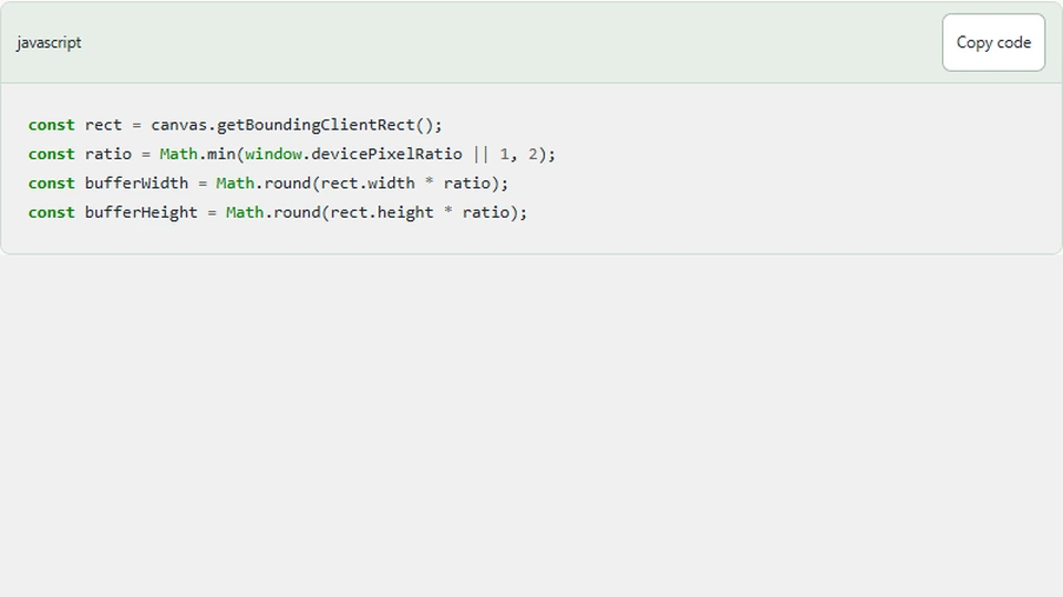
const rect = canvas.getBoundingClientRect();
const ratio = Math.min(window.devicePixelRatio || 1, 2);
const bufferWidth = Math.round(rect.width * ratio);
const bufferHeight = Math.round(rect.height * ratio);
A 360-by-202.5 CSS-pixel display at ratio two needs roughly 720 by 405 buffer pixels. A wide desktop canvas can need substantially more. Buffer memory and drawing work grow with area, so doubling both dimensions roughly quadruples the pixel count. Measure on the devices you intend to support.
Preserve logical drawing coordinates
After allocating the buffer, map logical coordinates into it. The game should still draw a card at the same logical rectangle and still place the collector at logical x=480. The context transform performs the conversion.
if (canvas.width !== bufferWidth || canvas.height !== bufferHeight) {
  canvas.width = bufferWidth;
  canvas.height = bufferHeight;
}
ctx.setTransform(canvas.width / 960, 0, 0, canvas.height / 540, 0, 0);
Use setTransform rather than repeatedly calling scale without resetting. Repeated scaling multiplies transforms, so calling the setup twice could unexpectedly enlarge everything again. Replacing the transform makes the setup idempotent: the same measured dimensions produce the same mapping.
Assigning width or height resets context state. The setup therefore applies its transform after any allocation. Drawing functions should continue setting the fonts, colors, line widths, and alignments they require instead of depending on another module's leftovers.
Keep HTML controls aligned
Memory Match overlays real buttons on the visible cards. Their positions are percentages derived from logical card rectangles, not backing-buffer pixels. That is helpful: changing buffer density should not alter the buttons' displayed geometry.
If you instead computed button positions from canvas.width, this extension would move their clickable areas as the buffer grew. Keep the three concepts separate: logical coordinates for rules and layout, CSS pixels for the displayed element, and buffer pixels for rendering detail.
Pointer conversion should also keep using the displayed rectangle and the fixed logical width. Multiplying input coordinates by pixel ratio would apply density twice: once during event mapping and again through the renderer's transform. The finger would no longer point at the visible card.
Resize at the right time
Run the setup after the element has a real layout size and when that size changes. A ResizeObserver is one option. Avoid assigning the buffer dimensions unconditionally in every frame. Even when the values appear unchanged, careless attribute assignment can reset state and do unnecessary work.
Pixel ratio can also change when moving a window between displays or changing browser zoom. Decide whether your setup responds to those situations. The first implementation can check on resize and document its limits rather than adding a complicated observer system without a test case.
Verify sharpness and correctness separately
First check that every card still occupies its expected place and keyboard focus outlines remain aligned. Then inspect symbol edges on a dense display. A sharper picture is not a success if card hit areas are wrong or the board changes shape after resize.
Compare performance with the original buffer on the same device and board. Keep a record of displayed dimensions and ratio; otherwise two screenshots can conceal different rendering workloads. The cap may need adjustment for large screens, but the model should remain independent of that decision.
Next steps
Use the Memory source viewer to locate the shared card geometry and rendering functions. Implement this extension in a separate copy of the downloaded example, then verify pointer mapping, keyboard access, and restart. Keep the original simple renderer available as a baseline for comparing both visual quality and frame cost.